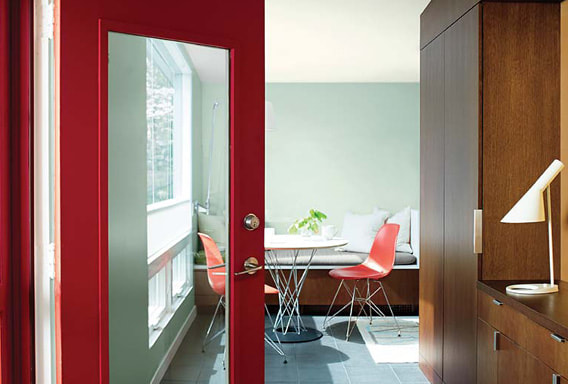
 BOLD COLORS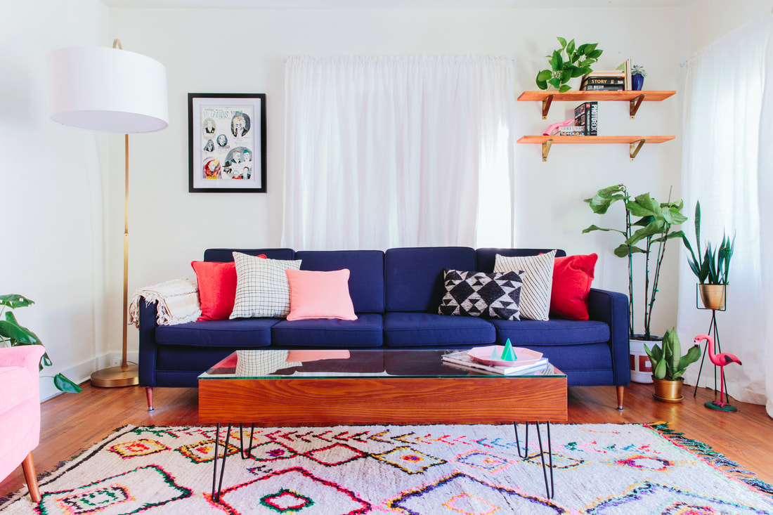
Photo © Taylor + Taylor

ADDING COLOR TO THE KITCHEN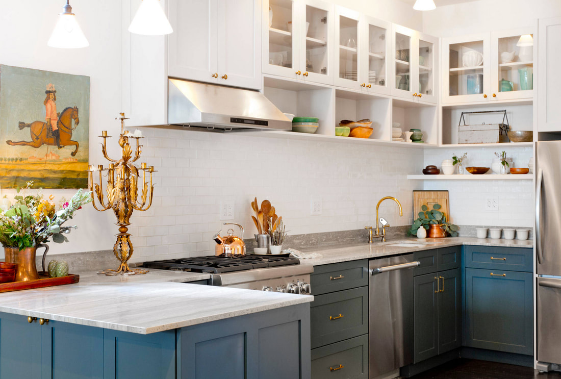

While white kitchens have taken over for the past year or so, color is making its way in. White will still be a color that will last, but homeowners are looking for a way to personalize their space. Colors that will be popular in the kitchen are blues and grays, and warm wood tones. CONCRETE ACCENTS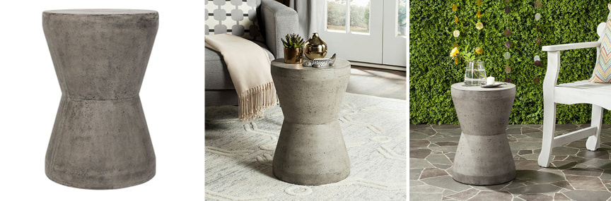
Photos © safavieh.com

Concrete is already a popular material choice for the home, but expect to see concrete in places you don’t expect. Such as wallcoverings, accessories, furniture, lighting and tile. Designer Yanic Simard says, “The humble material and its comforting cool tones mixed with light linen and pearl grays add relaxed air to any space.” MIXING METALS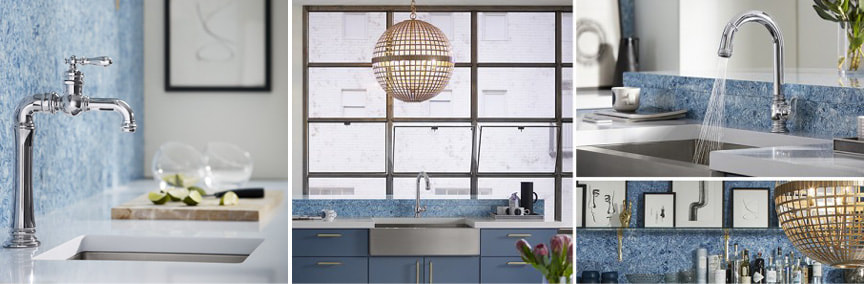

Mixing 2-3 different metal finishes in your space is a fun way to get creative and give your space extra character. There are many ways to achieve this look; use one metal finish for your lighting, another finish for your hardware, and one last finish for your faucet. MILLWORK FEATURED WALLS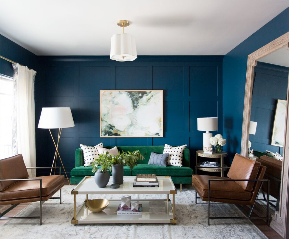
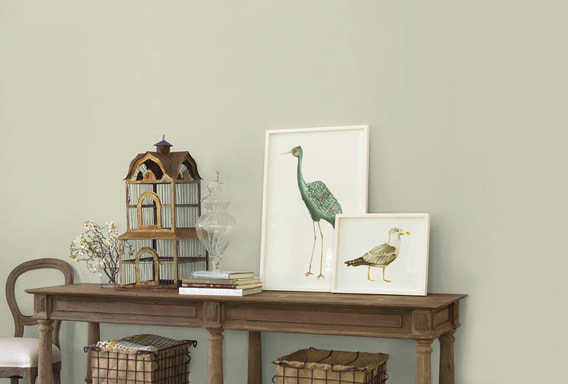
Photo © Studio McGee

Chip and Joanna Gaines may be leaving, but their shiplap sure isn’t. With many DIY videos out, this trend will be easier to accomplish. Using millwork, reclaimed wood and shiplap in design is no new concept, but using it to feature a wall is a top trend.
1 Comment
2018 has started off with a bang with introducing its new colors of the year.
Think BOLD, empowerment, visionary, vibrant, with splashes of serene and calming tones. This year is turning a new leaf to engage with moodier and reflective hues, like vibrant purples, bright blues and daring reds, but the colors of our life can’t always be dominating. So several paint companies have showed their softer side to encourage self-reflection and relaxation.
Lets take a look at some of the paint colors that will be taking over 2018.
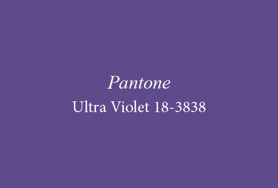
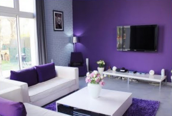
Pantone – Ultra Violet 18-3838
“A dramatically provocative and thoughtful purple shade, PANTONE 18-3838 Ultra Violet communicates originality, ingenuity, and visionary thinking that points us toward the future.” Pantones color of the year does not only represent a color that is trending in design, but also echoes what our world needs. Many people were shocked by Pantones color choice and have decided against it., which leaves many puzzled on how to decorate with it. A great way to use Pantones color is to incorporate it in pillows, rugs, and candles. If your feeling courageous, use it as an accent wall.
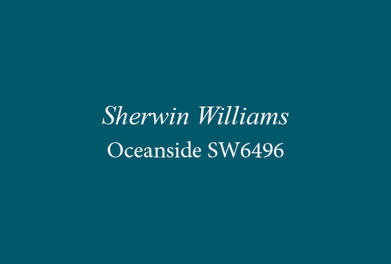
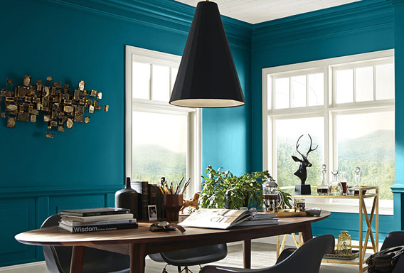
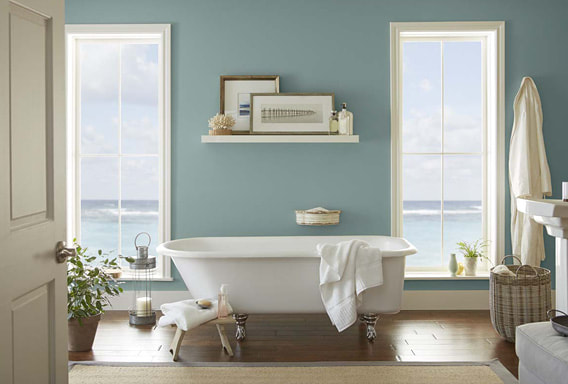
Sherwin Williams – Oceanside SW6496
Blue is one of the most universally loved color in the world. It is never to surprising when blue becomes the color of the year. But this year Sherwin Williams shocked everyone with their bold statement of a blue-green hybrid. Oceanside is a great color to incorporate in your home, whether you own a mid-century modern, traditional, farmhouse or contemporary home. It fits in all different lifestyles. For those not willing to give up on white yet, this color is great to contrast with.
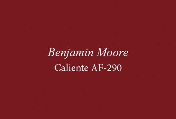
Benjamin Moore- Caliente AF-290
Benjamin Moore’s Caliente Red is a radical choice of color. People who use red within their space need to be confident about using it. It’s a very striking and fearless color to use if you are unsure. If you feel up to the challenge use this color for a focal point—such as a mantel, a bookcase, or the inside of a bookcase.
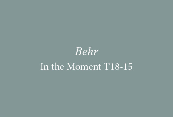
Behr – In the Moment T18-15
The name of the color says it all. Behr’s color of the year inspires us to relax, take a break, and be present. The mix of the blue, green and gray color calls for restoration and solace. With our day-to-day lives being so busy, this color reminds us to be “In the Moment”.
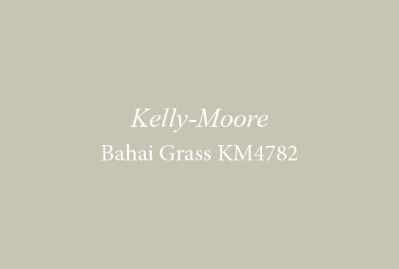
Kelly-Moore Bahai Grass KM4782
Last but not least, Kelly-Moore brings us a neutral alternative that will leave your home feeling breezy and light, with a side of warmth. Bahai Grass is a soft and light sage with a hint of yellow that exudes a summer breeze.
|

Diane Gassman CMKBD, CAPS
Principal, Designer, Interior Dimensions, LLC
AuthorS
Interior Dimensions LLC is a premier, award-winning design firm in Tumwater, Washington. Archives
November 2023
Categories |
 RSS Feed
|
Interior Dimensions LLC
Design Studio 502 Custer Way SE Ste A Tumwater, Washington 98501 (360) 701-8986 [email protected] |
|

|